3Pas brings culturally-inspired stories to life through feature films, scripted and unscripted television, podcasts, digital experiences, and more.
With first-look English language deals at ABC Signature for television, Lionsgate for features, and TelevisaUnivision for Spanish language content, 3Pas develops and produces English and Spanish language content for global audiences.
3Pas is headquartered in Los Angeles with hubs in Mexico City, Miami and New York.

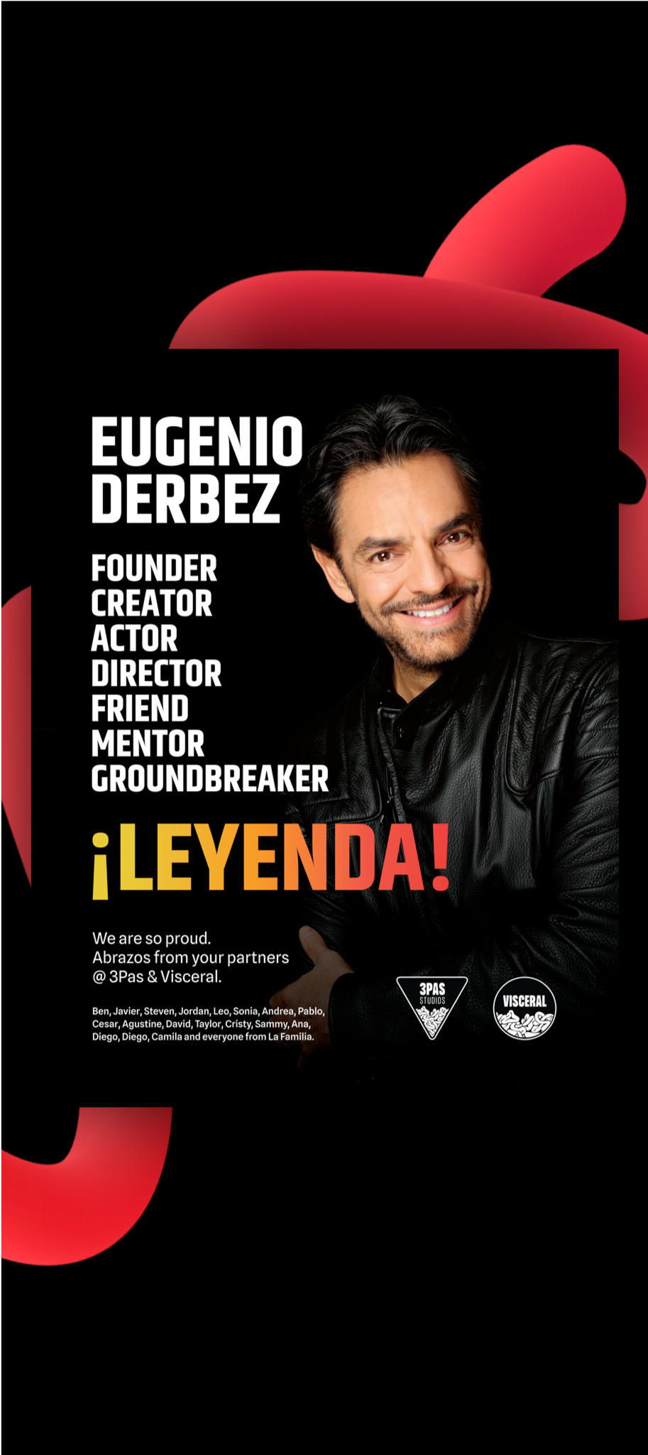
Bright colors are synonymous with the liveliness and exuberance of Latin American culture. Incorporating hues like vibrant reds, deep blues, and energetic yellows into the company's visual elements instantly evokes a sense of warmth and passion. These colors reflect the diverse landscapes, traditions, and emotions portrayed in Latin films, fostering a connection with audiences who seek authentic and culturally resonant storytelling.
Swirls and curves add a layer of expressiveness to the visual language. They mimic the rhythmic movements of dance, the flowing contours of landscapes, or the intricate details of traditional art but mostly the relate to the "guts" pan from the name. By incorporating swirls into the visuals, 3PAS communicates a sense of fluidity, creativity, and a willingness to explore new narratives and perspectives.
Bright colors, infuse the brand with the lively spirit inherent in Latin American culture. These hues bring forth a sense of passion, warmth, and expressiveness. The bold color palette immediately engages audiences and sets the stage for an immersive cinematic experience.
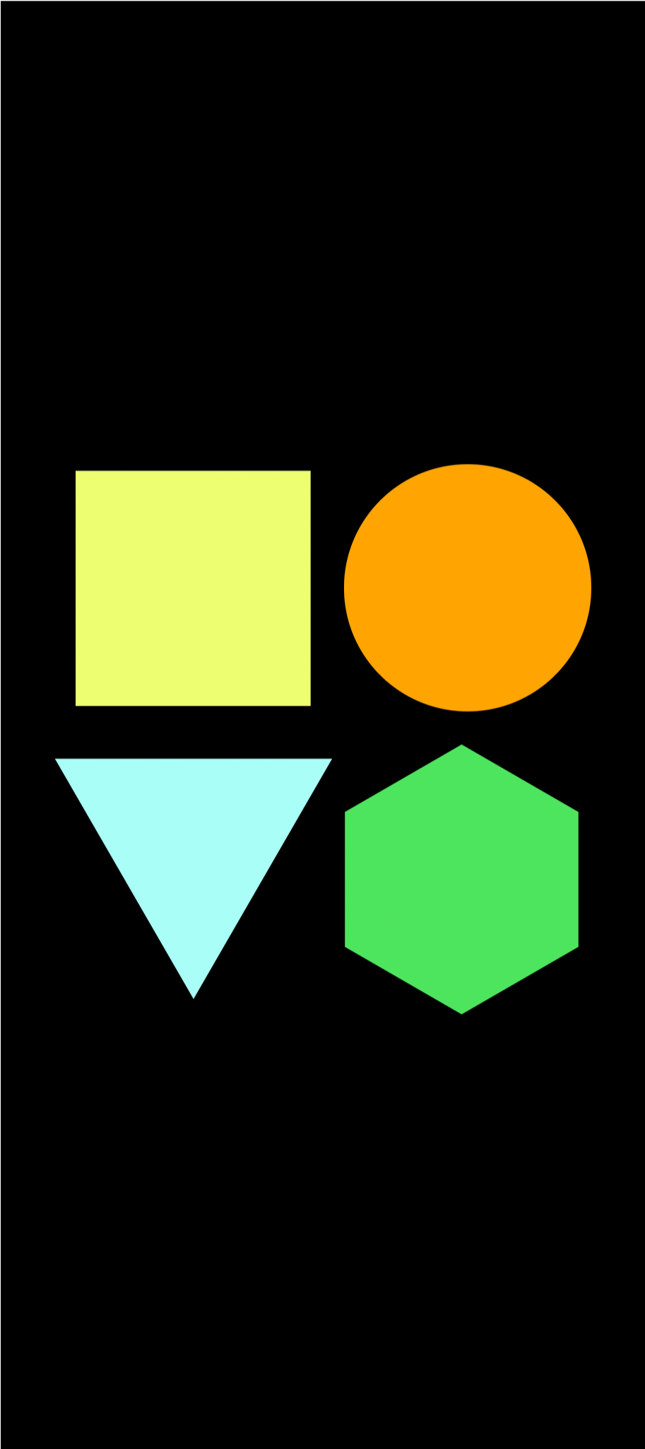
Geometric shapes provide a sense of order and structure, creating a visually appealing balance to the exuberance of bright colors. Clean lines, symmetrical patterns, and well-defined shapes evoke a sense of precision and professionalism. This structured elegance communicates a commitment to quality and a meticulous approach to filmmaking, enhancing the company's credibility in the industry.
Competitive benchmarking, User and Product discovery, Brand development, Low-fi prototyping, Hi-fi prototyping.
Amidst the dynamic swirls and bold colors, a clean layout serves as the canvas of sophistication. Clean lines and organized spacing provide a structured framework that enhances readability and professionalism. This layout allows the vibrant elements to shine without overwhelming the viewer, creating a balance between creativity and clarity.
Simple geometric icons offer clarity, versatility, and instant recognition. Their minimalist design ensures universal understanding, easy integration across platforms, and quick memorability. Whether in branding, user interfaces, or signage, these icons simplify communication, contributing to a visually cohesive and user-friendly experience.
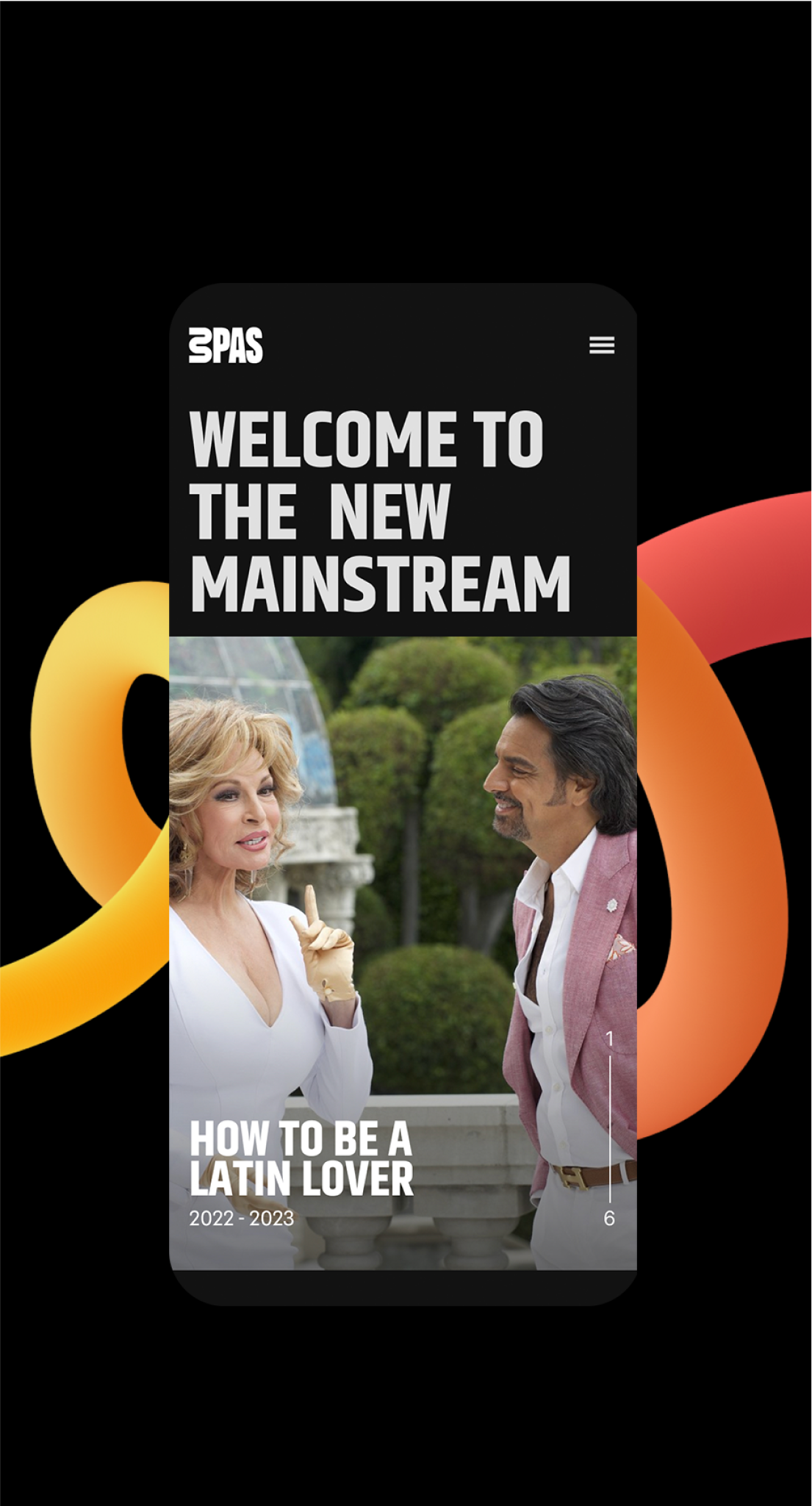
Infusing the brand experience on every view port.
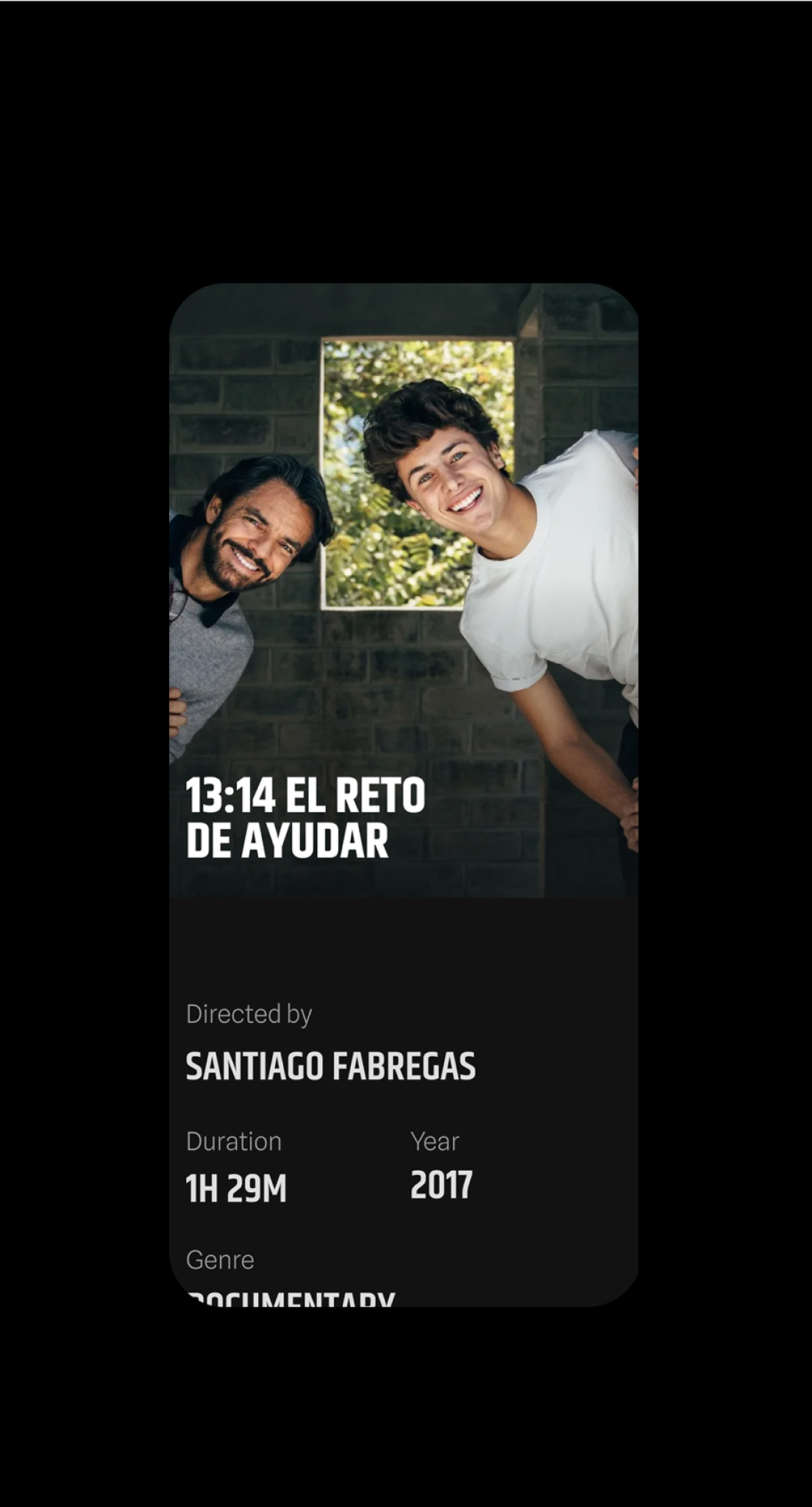
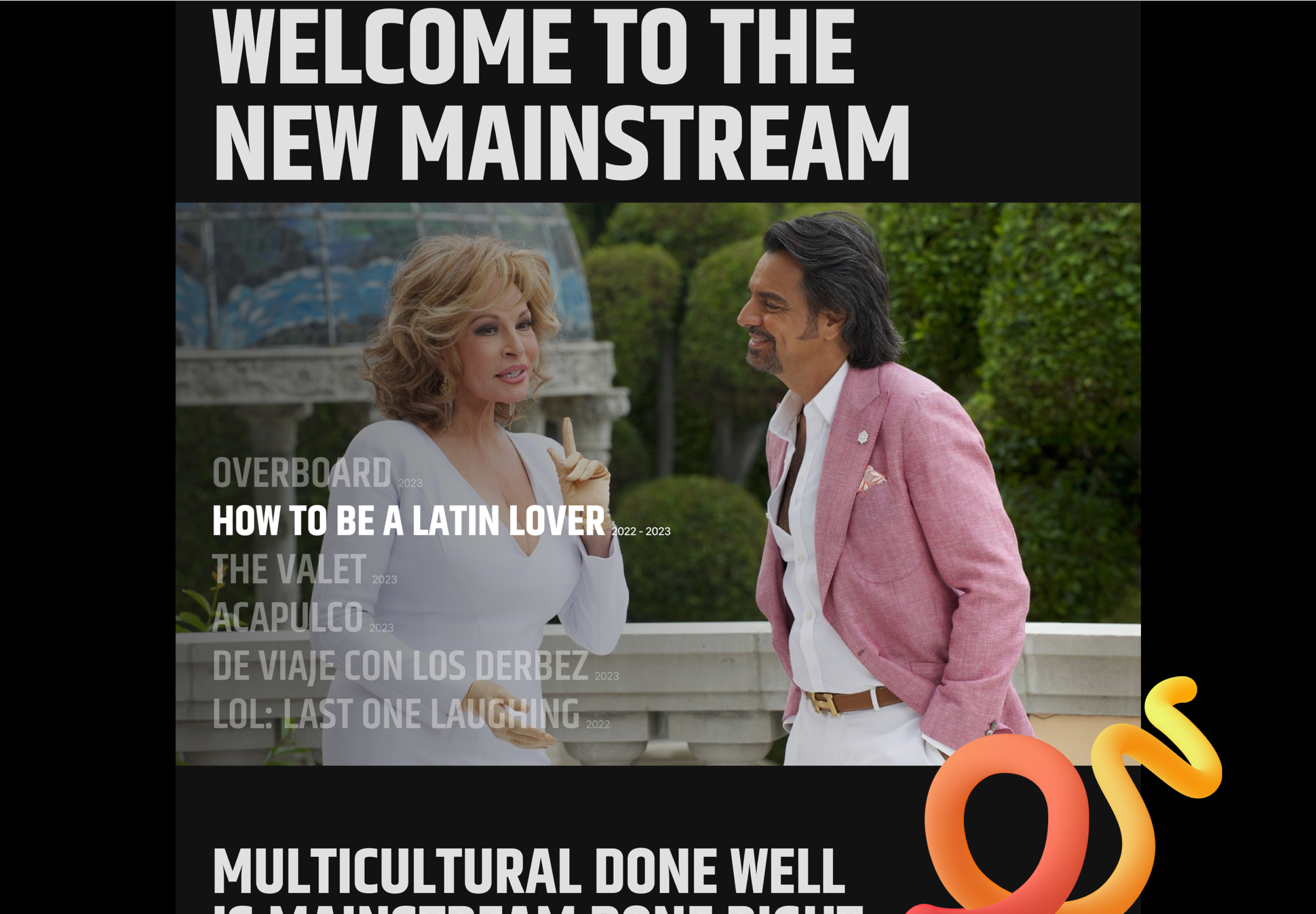
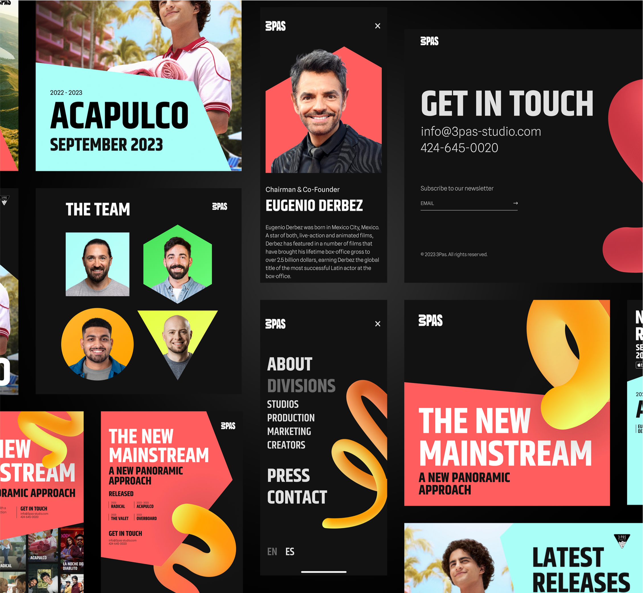
Production detail page
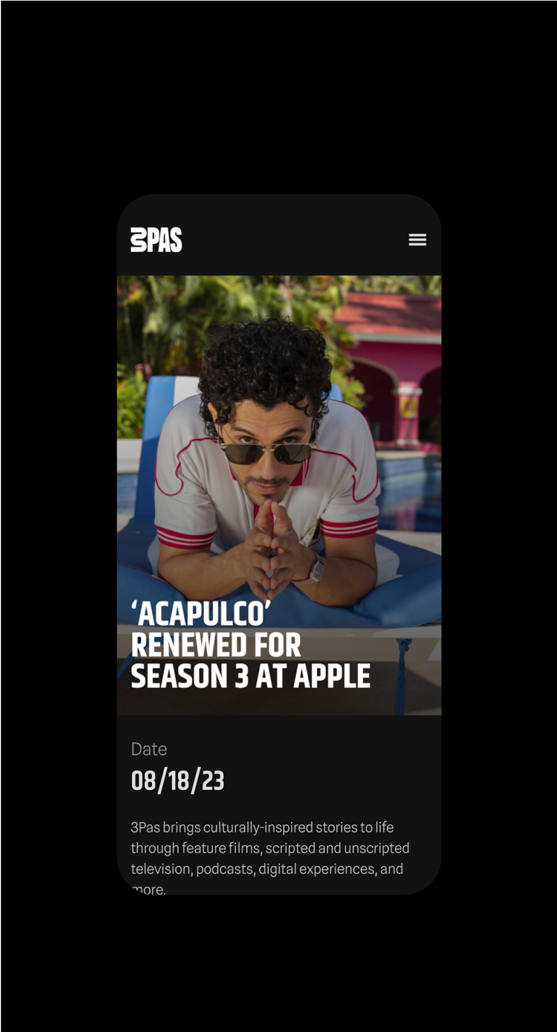
Press and news
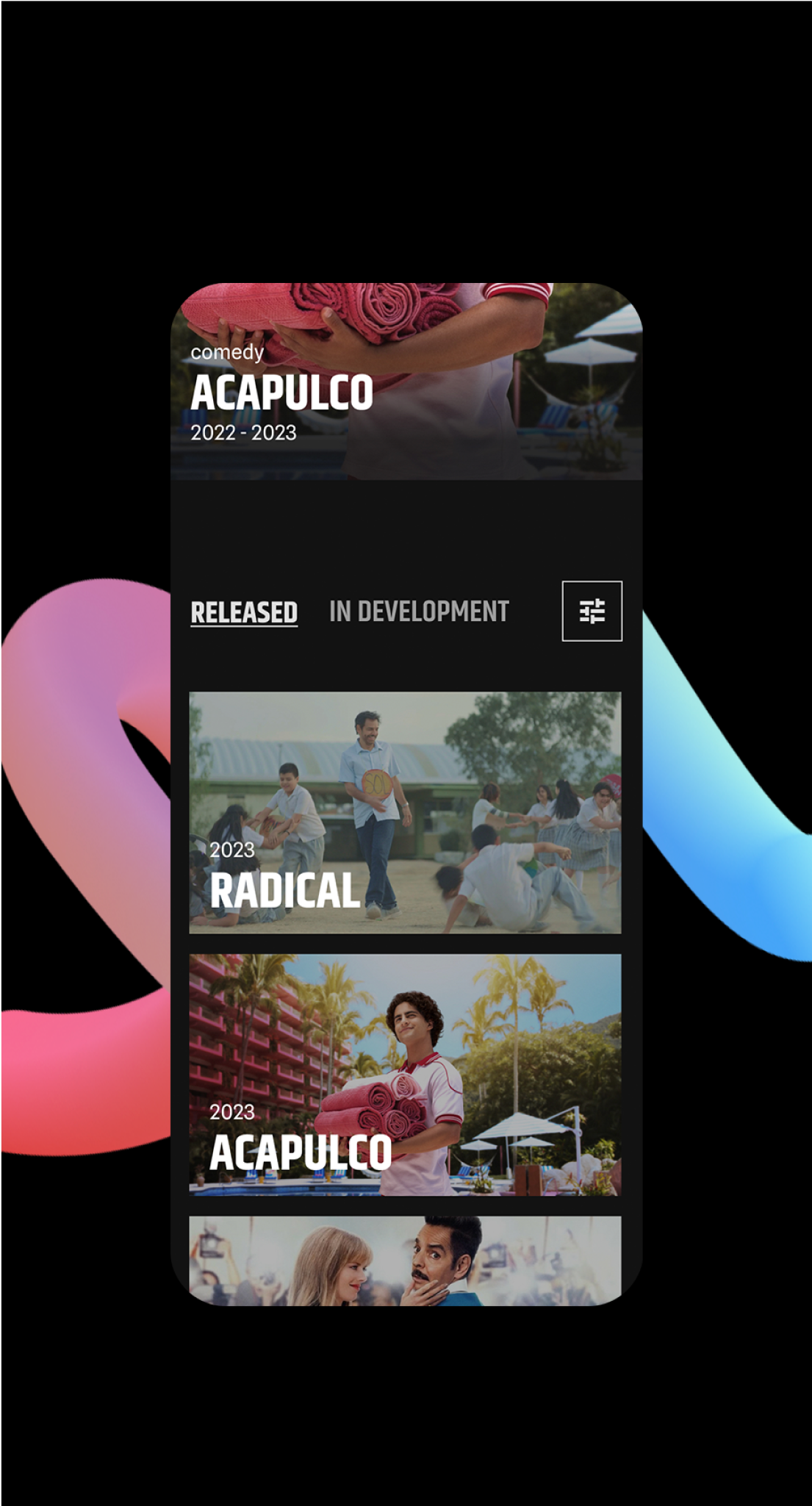
Dynamic movie library